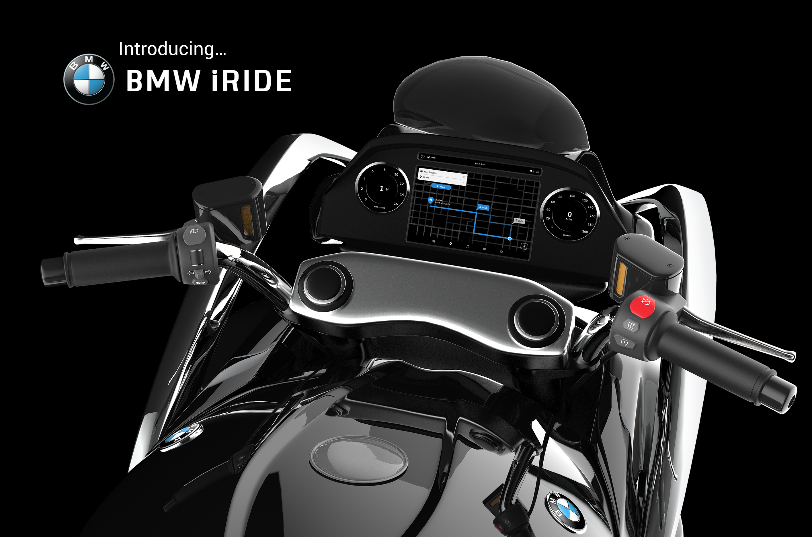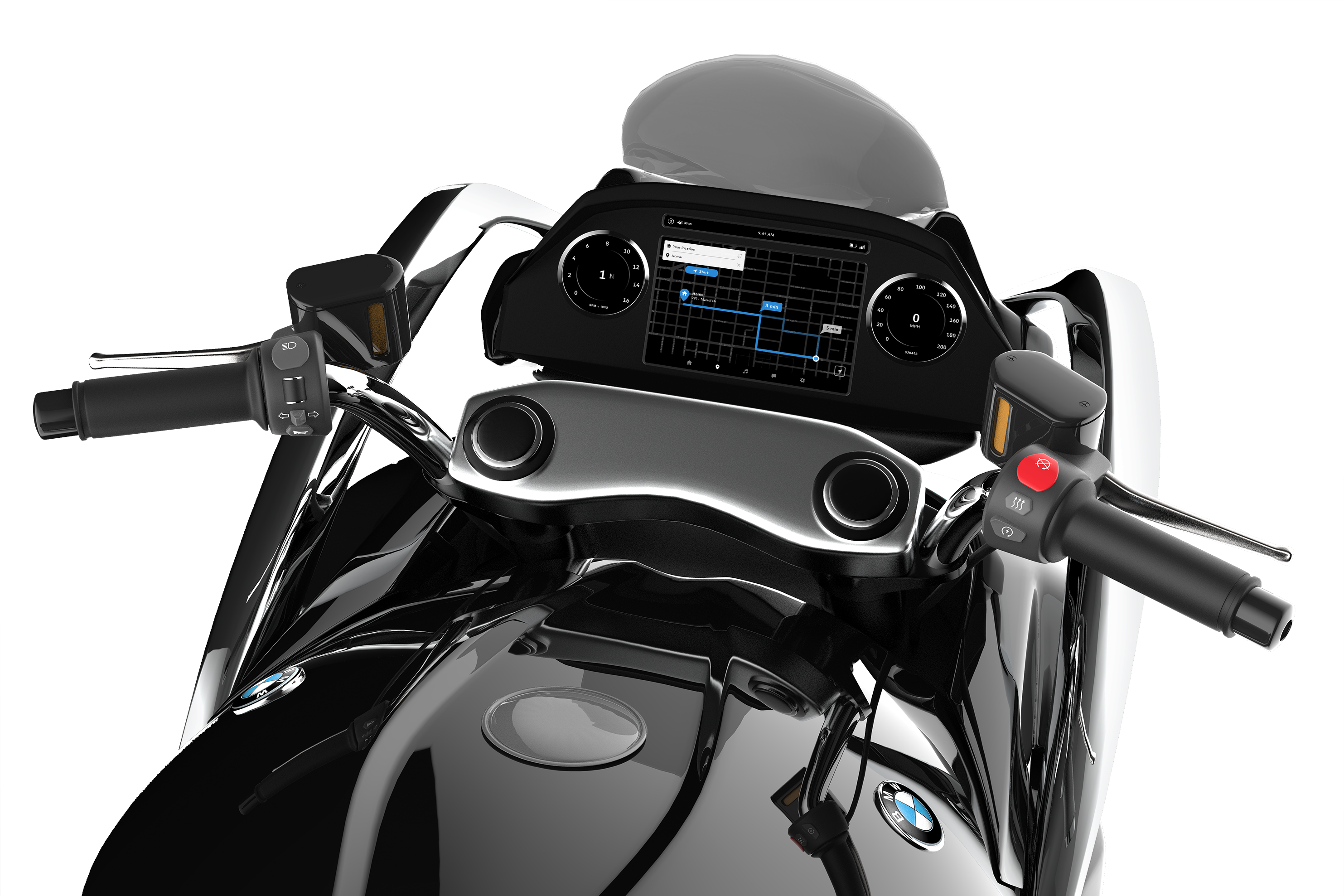
BMW iRIDE is a system developed for a sports touring motorcycle in the year 2030. The project was born out of an interdisciplinary collaboration with transportation designer Torin De Joy. My focus was the bike’s interface and technological components while Torin was responsible for the bike’s physical design.
The project went on to win the Director’s Choice Award, best in show at the 2019 DAAPworks Show and is currently featured in an exhibition at the Reed Gallery at the University of Cincinnati.
SkillsUX/UI Design, Interaction Design, Motion Design, User Research, User TestingTimeline16 weeks
THE PROBLEM
Motorcycle riders are 37x more likely to die in a motorcycle crash than their counterparts in automobiles. But technological advances in cars are leaps and bounds ahead of motorcycles in terms of safety features. Additionally, there is no safe, eyes up system for motorcyclists to utilize their smart phones while riding.
USER RESEARCH
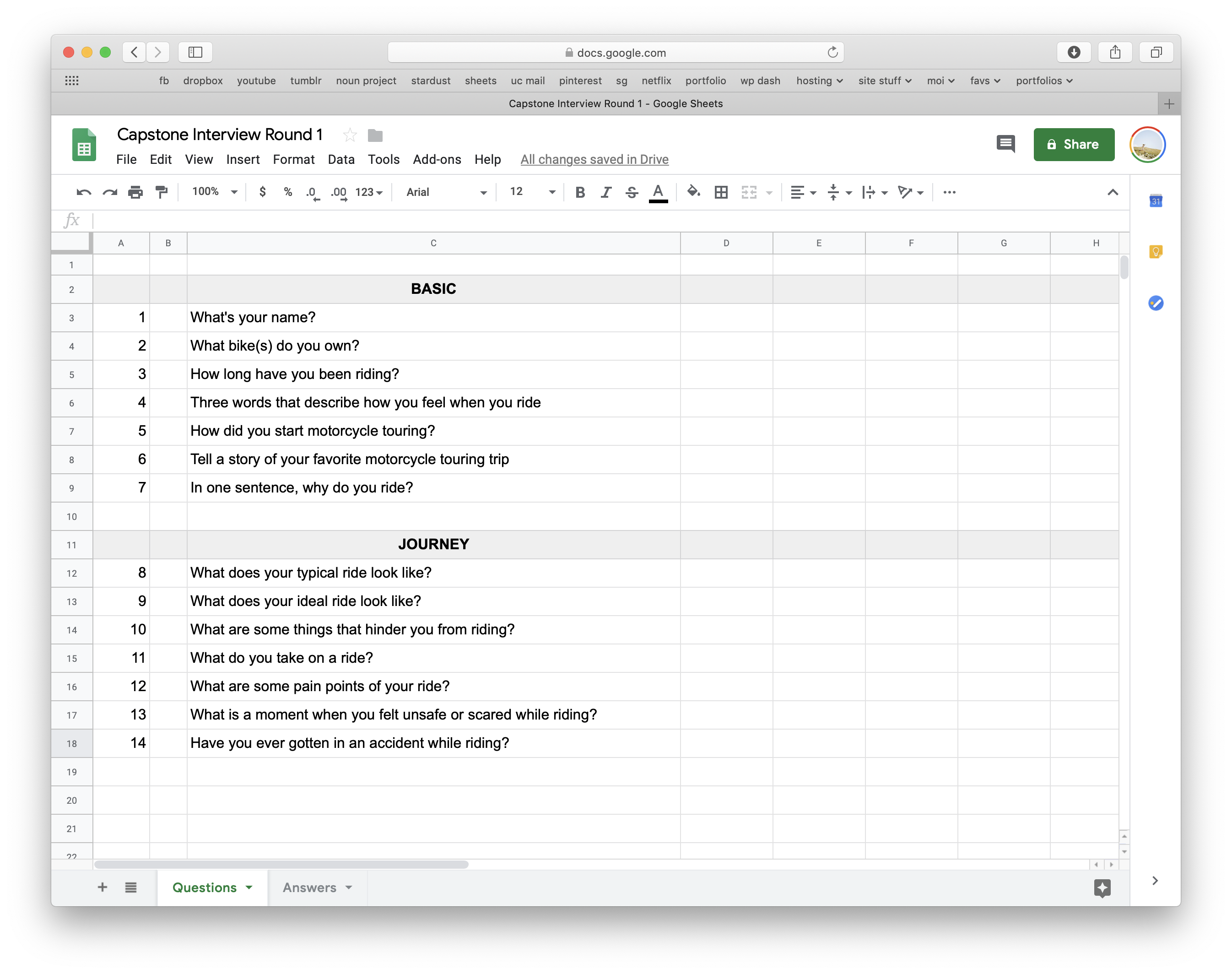
INITIAL INTERVIEWS
To kick off this project, I began by talking to motorcycle riders, both in person and online thru Reddit forums, about their experiences. As someone who initially knew very little about riding and motorcycle touring, I wanted to go in as open minded as possible so many of the questions are purposely general and open ended.
Objectives:
Learn more first-hand about motorcycle riders: why they ride, what drives them, their personal feeling towards riding, etc. I also wanted to get a grasp what a ride is like and what the joys and pitfalls are.
Findings:
Motorcycle riders love riding and most consider it a part of their personal identity. Many emphasized the freedom and thrill they get from riding. I found it surprising that many riders had a hard time pinpointing the negatives of their ride because it is so enjoyable for them. I noticed the more often someone rode, the more problems they had to talk about.
Click Image to View Larger
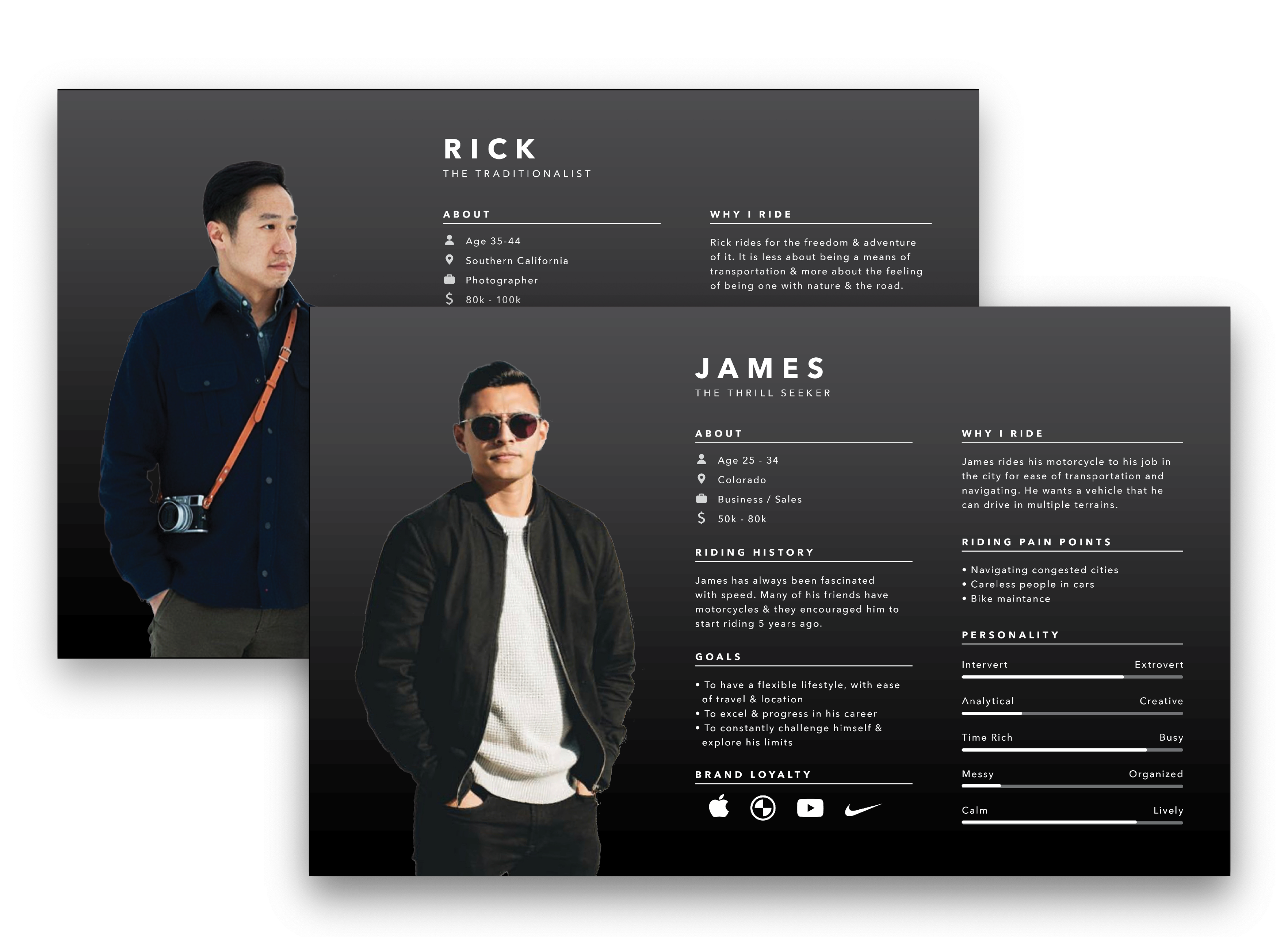
PERSONAS
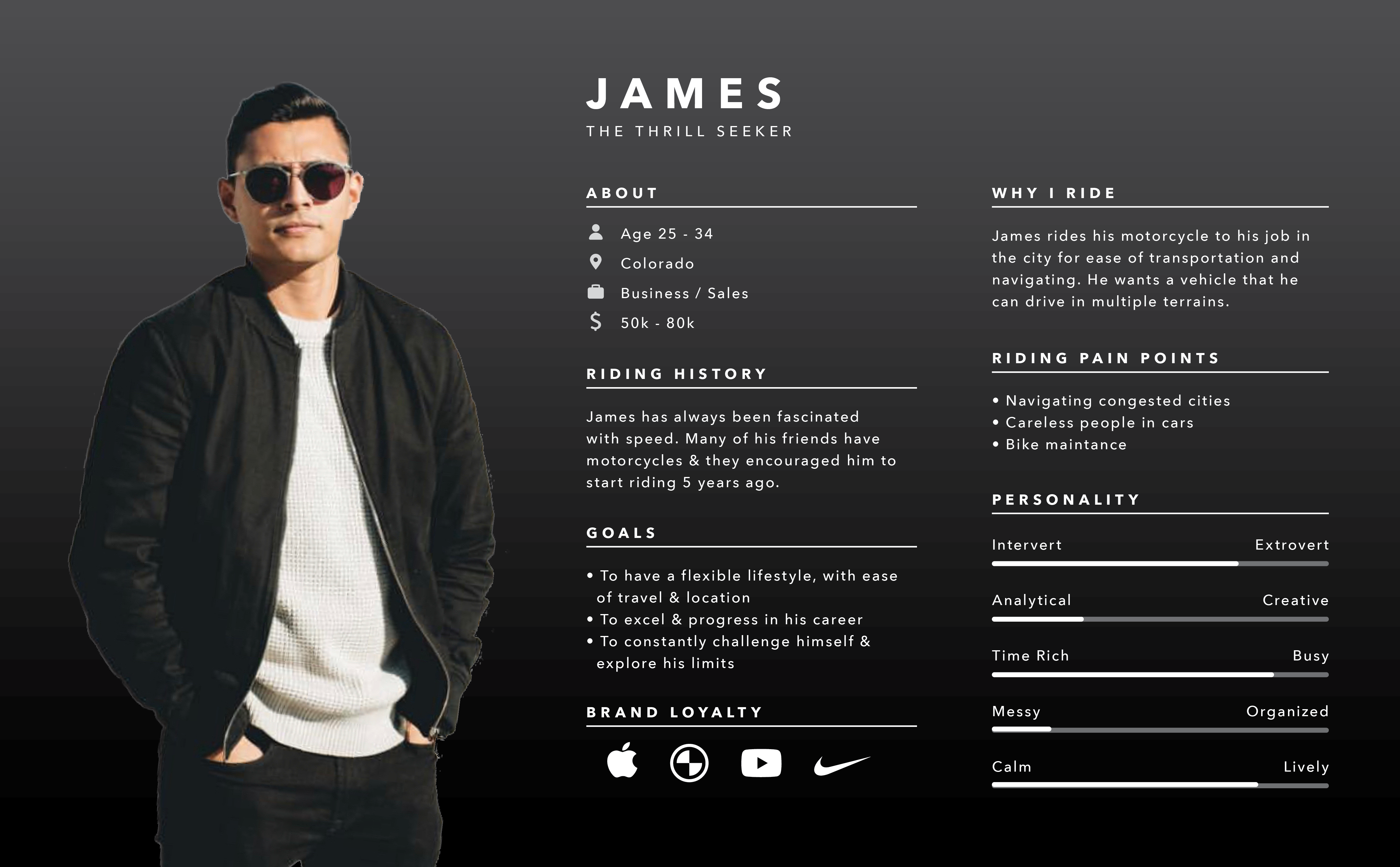
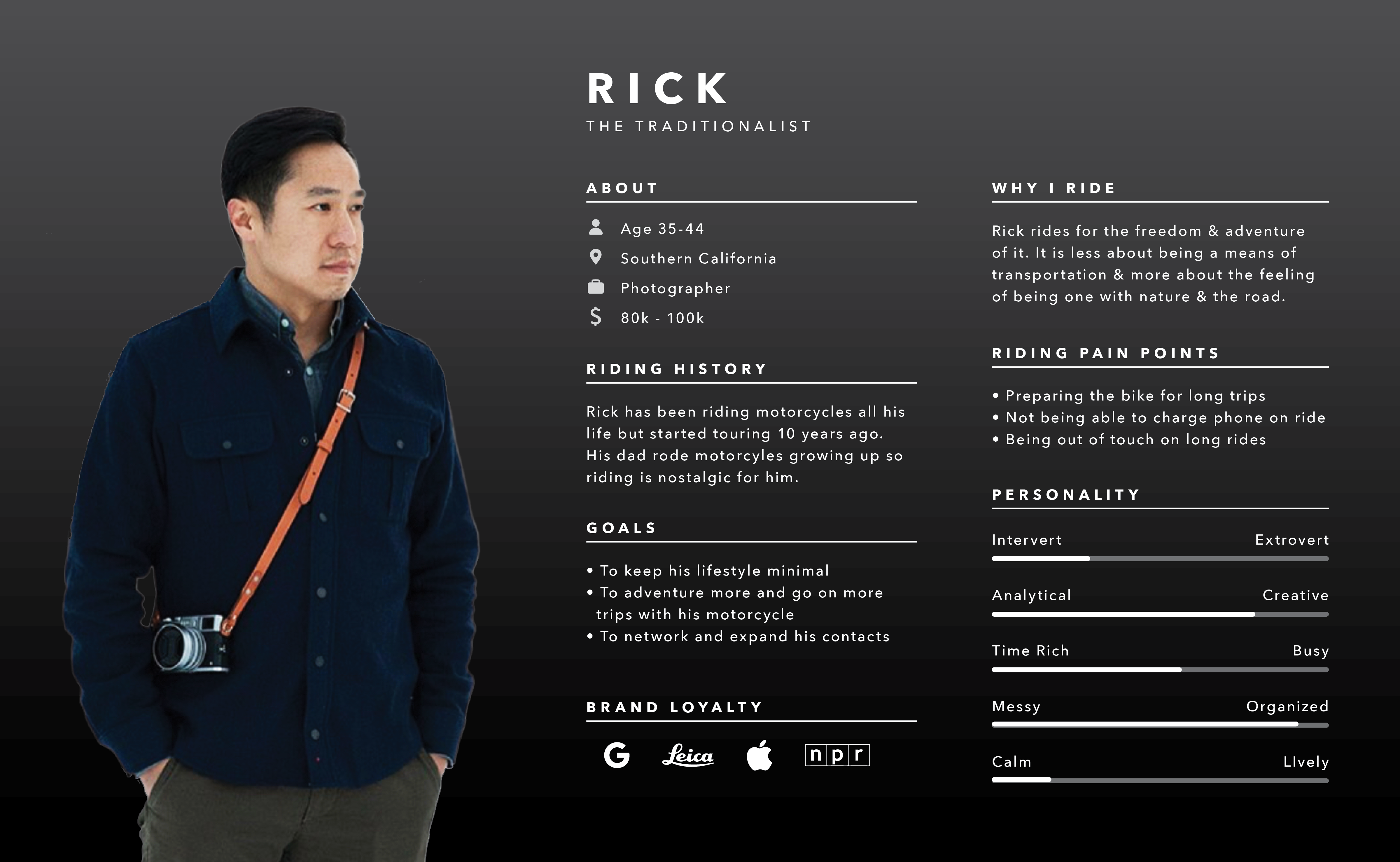
After my initial interviews, I started to synthesize the data by creating user personas based on patterns I saw with the riders I interviewed.
The personas include the following sections: demographics, history, goals, motivations, frustrations, personality, and favorite brands.
Learning:
During my time working at Evolve Collaborative, I learned the importance of well crafted user personas. During this project, my personas helped me organize my interview responses and identify patterns with the data, as well as keeping me focused on the user throughout the project.
JOURNEY + PAIN POINTS
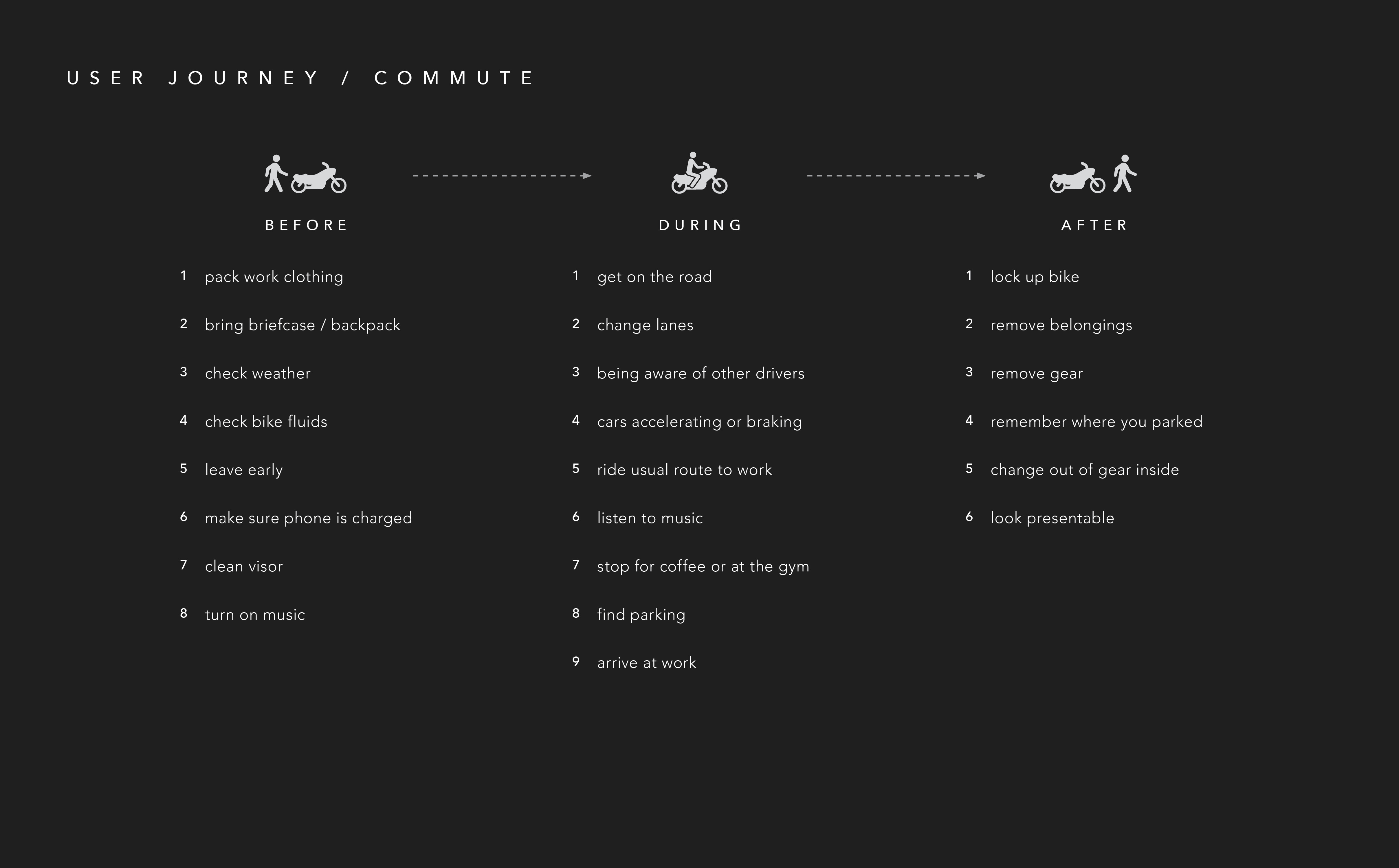
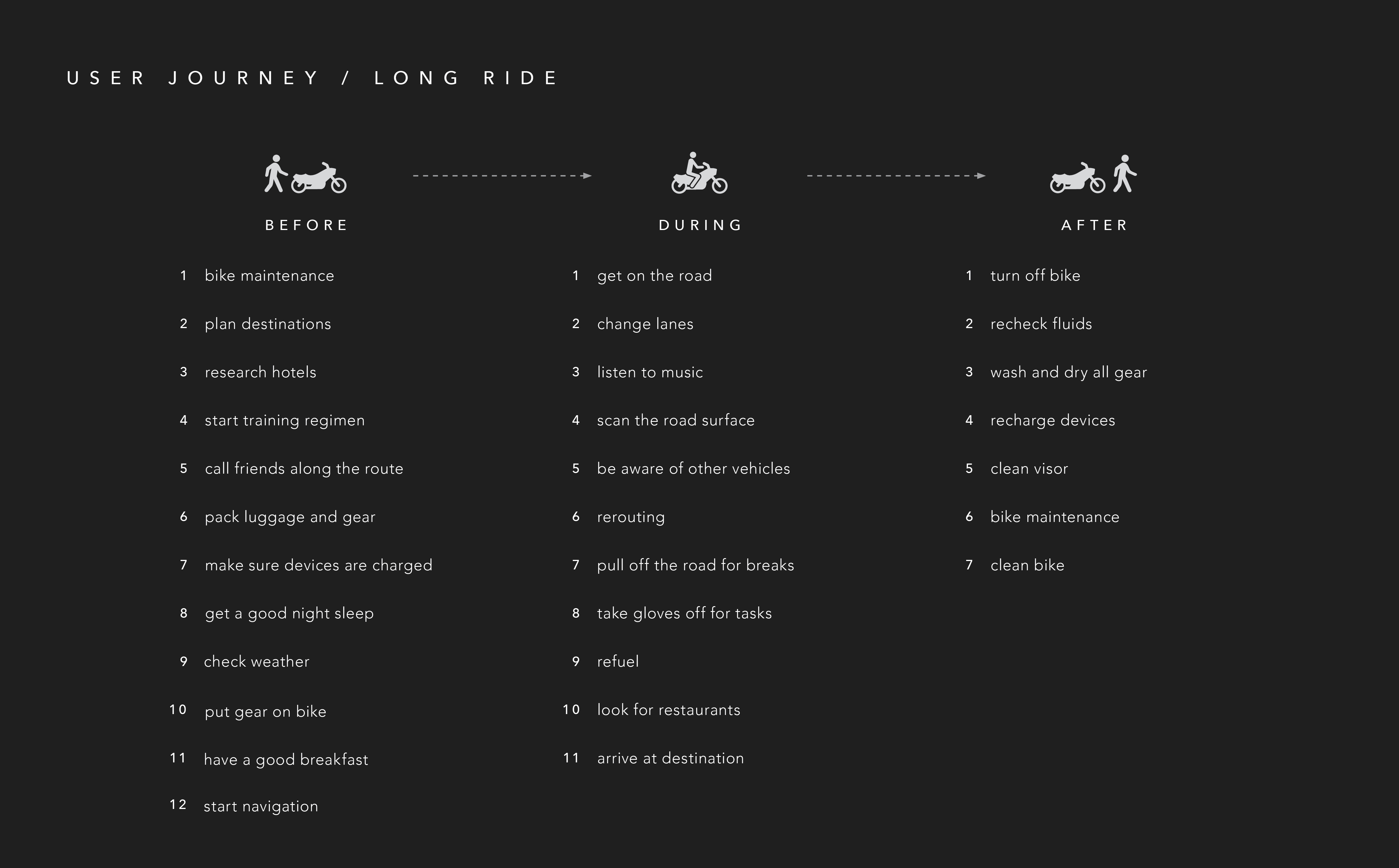
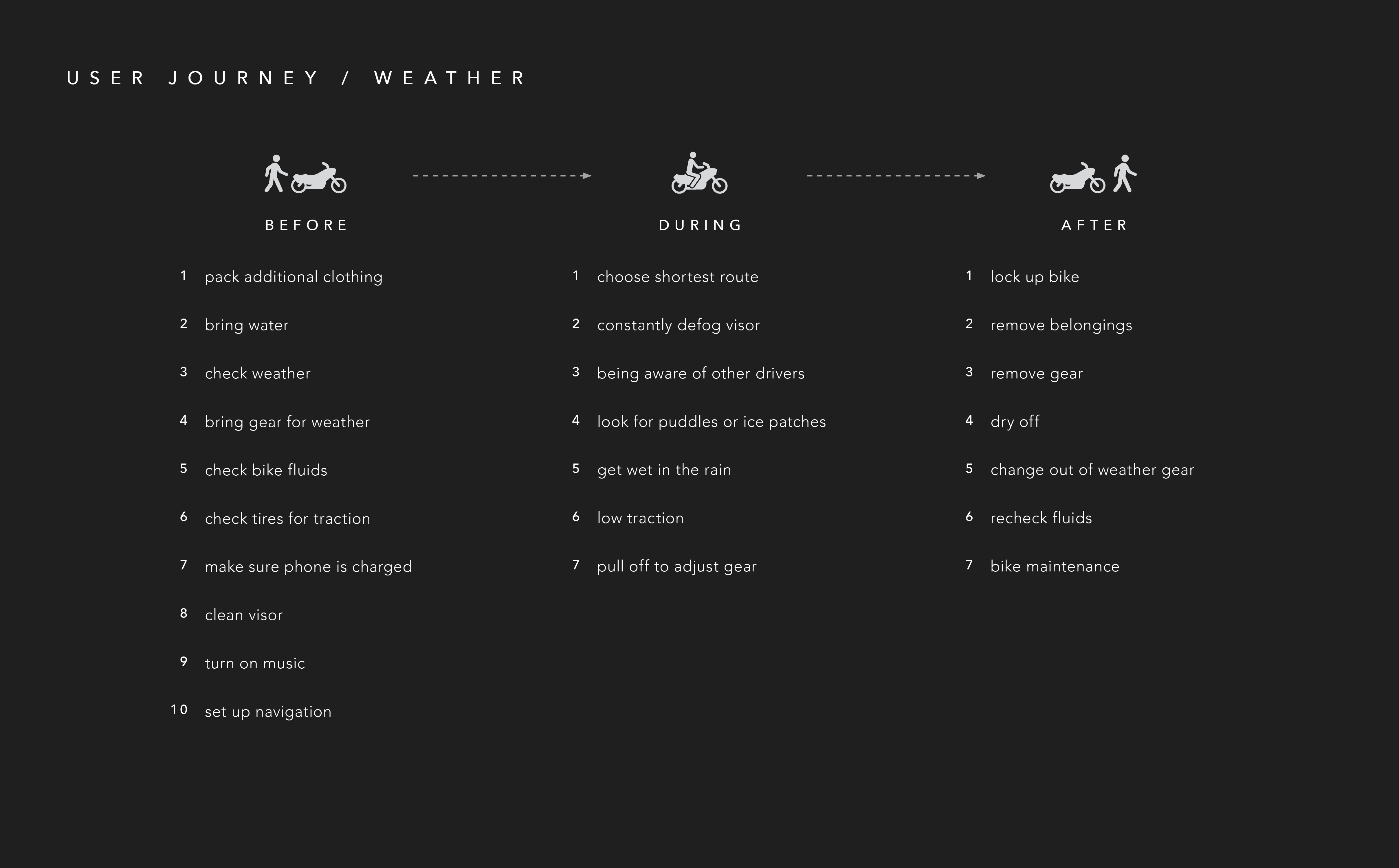
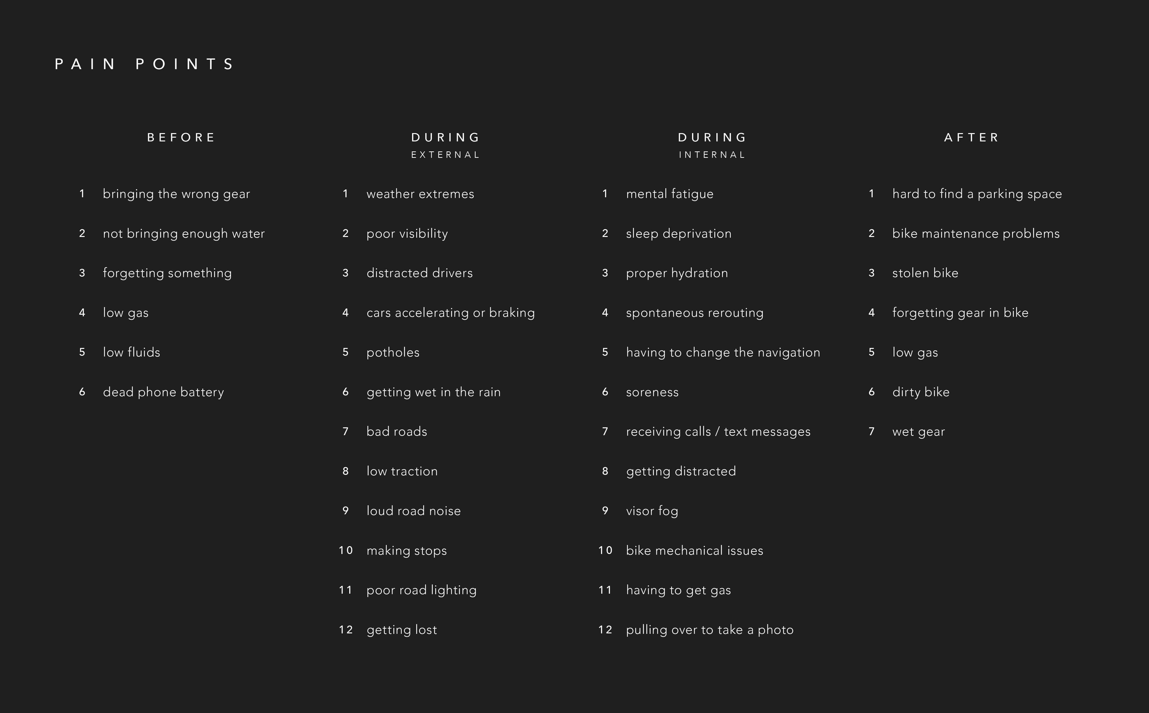
Journey maps are another way I synthesized the responses I got from my first round of interviews. My goal was to discover the pain points and to narrow in on what I should focus on solving with my design. I made multiple journey maps, exploring the different contexts in which riders use their bikes because I found the pain points differ according to how the bike is being used.
MIND MAPPING
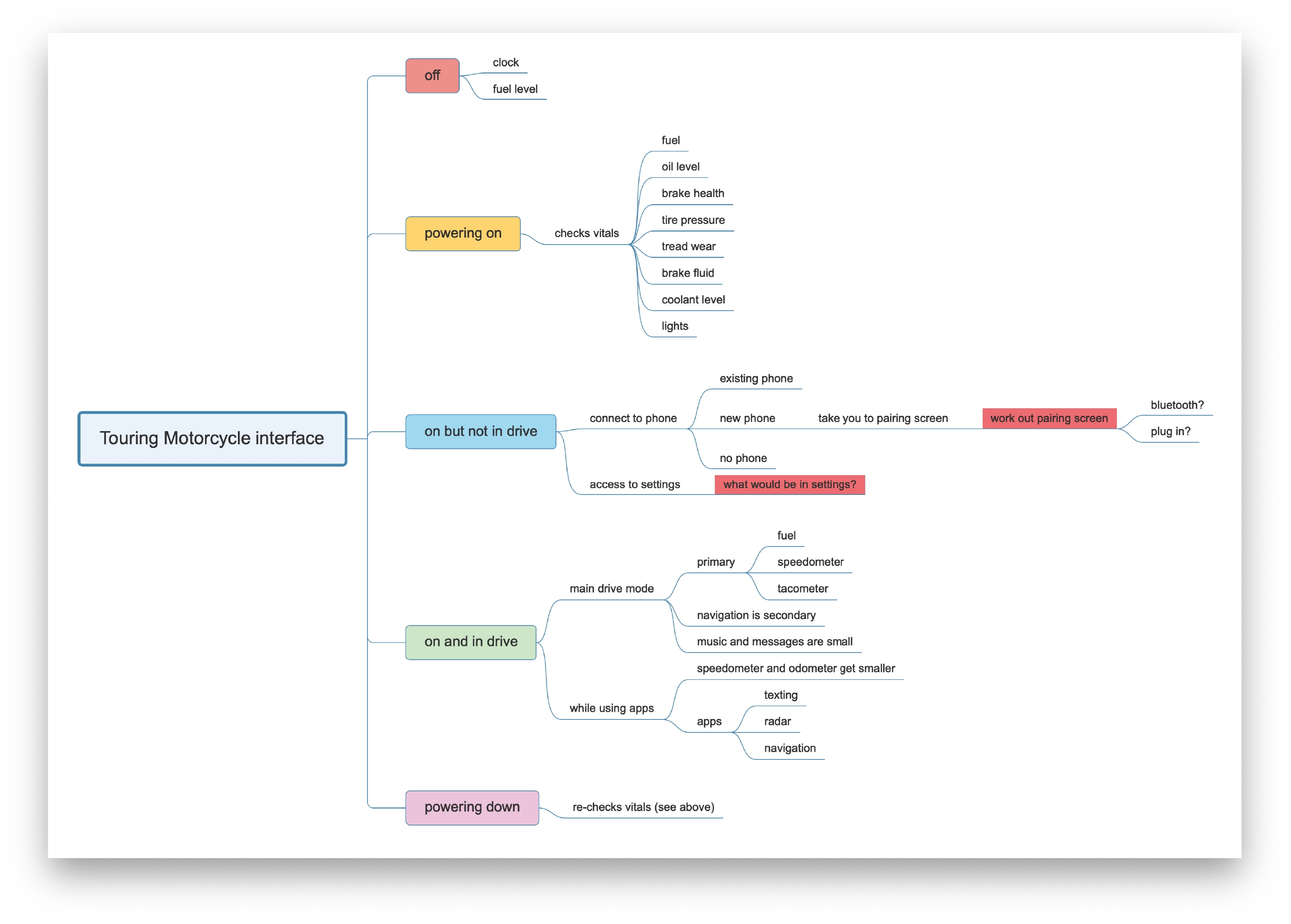
Once I had a clearer idea of the pain points and problems I wanted to solve, I started mind mapping to help me generate ideas and make connections. My original mind maps started on paper but I later moved to using MindMaster which allowed me to reorganize my ideas and quickly build off ideas I already had.
DESIGN DEVELOPMENT
USER TESTING
To kick off the design portion of the project, I once again went back to the user. I talked with both riders I had already talked to before and new riders to get different points of view.
Goals:
• See riders thoughts on using technologies like AR and voice assistance
• Assess what problems are most important to focus on
• General brainstorming about ideas relating to smart phone integration, app use and eyes up cognition
Tools:
• Worksheet to assess which devices and apps are most used by riders
• Card sort of pain points to narrow down which are most important
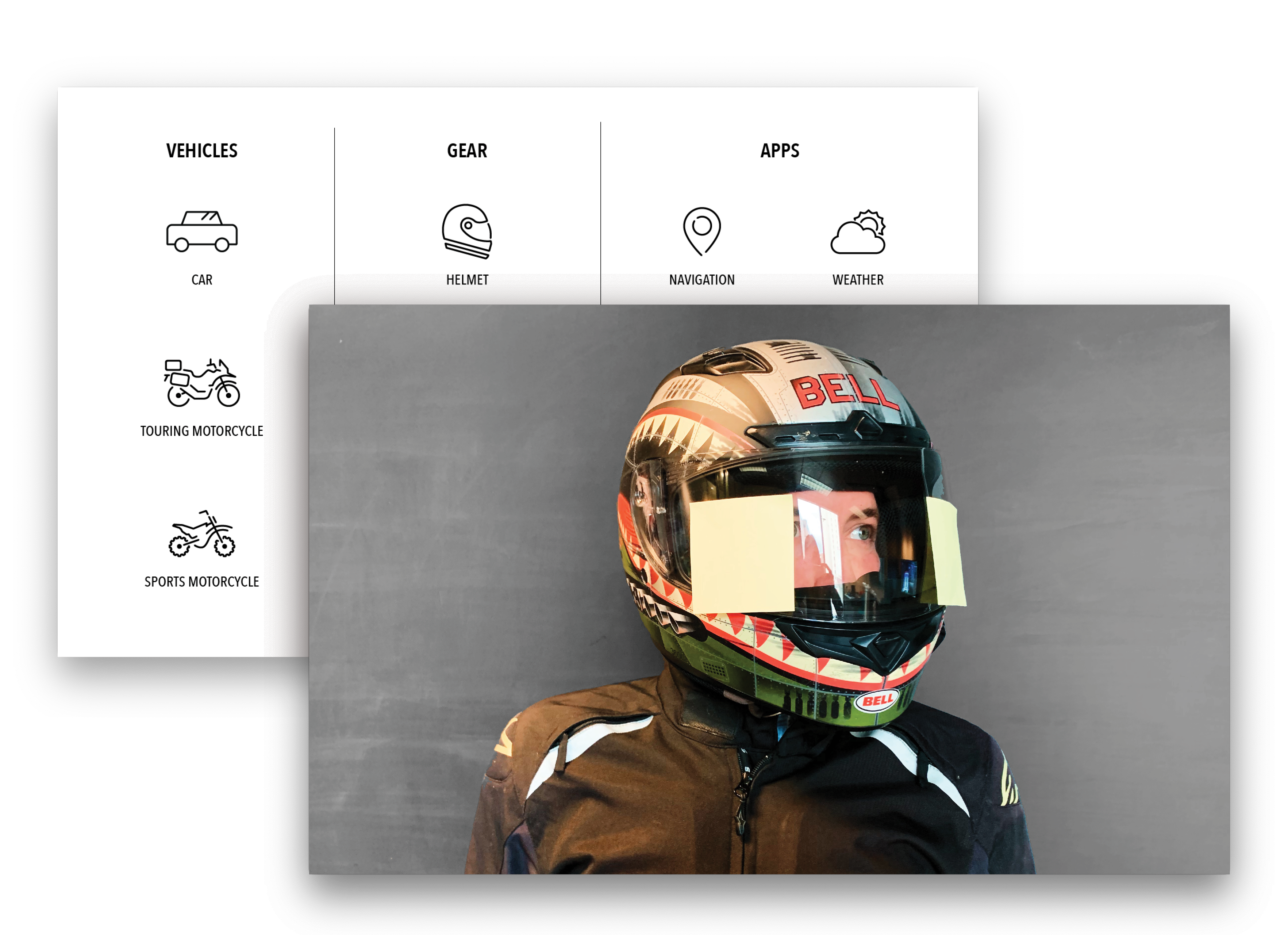
• Helmet + post-its to discover the most important data on an eyes up display and how the riders eyes naturally move
INFORMATION HIERARCHY
From the input from my user testing, I developed a system of organizing information to guide me as I started to design flows and wireframes. I realized many riders were wary of in-helmet AR but they seemed to open up to it if the information was simple and only the most essential.
Crucial: tachometer, speed, safety alerts, simple navigation
Important: full navigation, music controls, gas, time, notifications
Less Important: text messages and calls, music interface, diagnostics, settings
SCREEN MAPPING
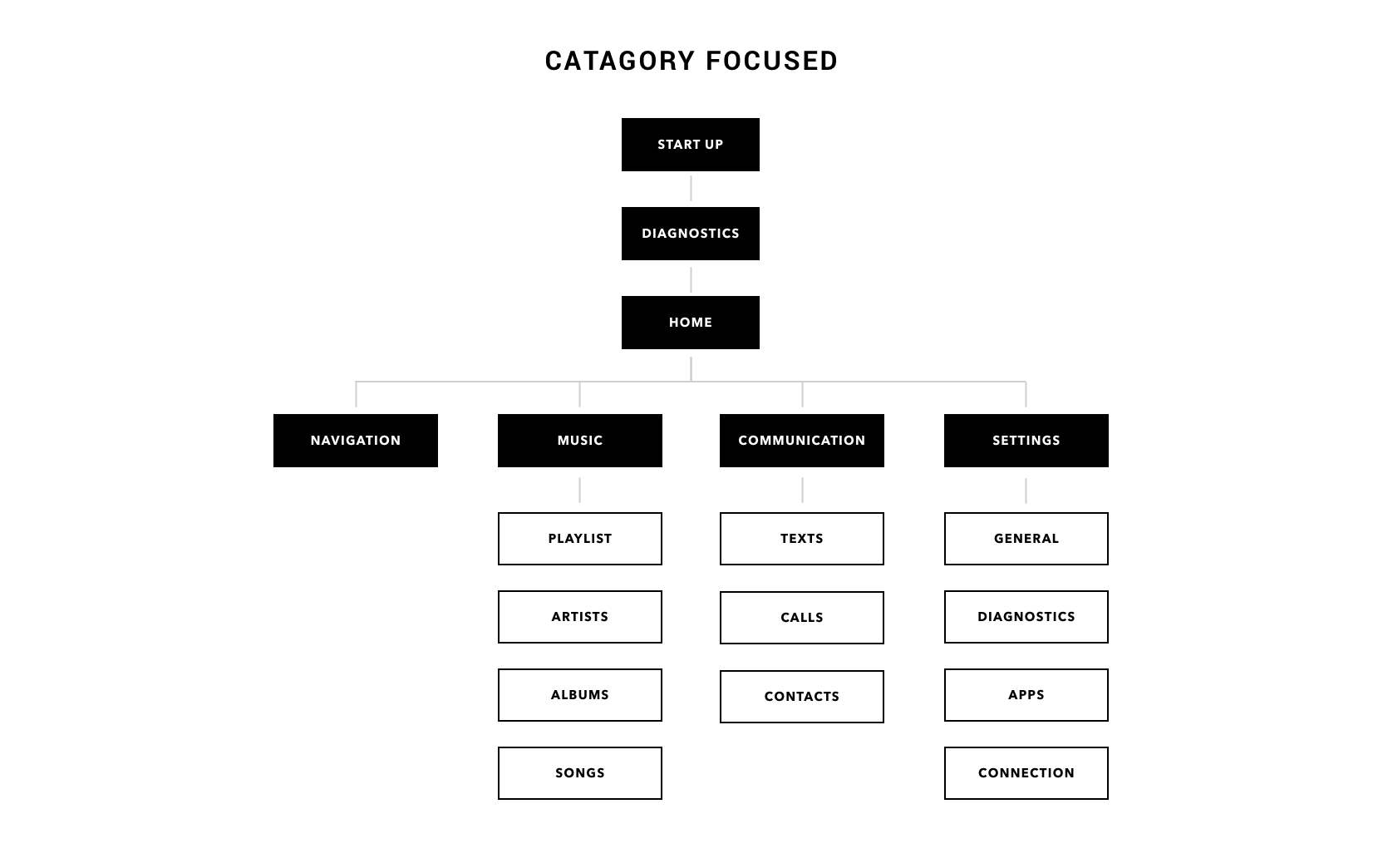
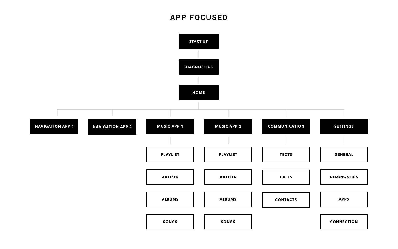
Once I had a system in place for organizing and prioritizing information, I started screen mapping. I started with a physical card sort to figure out the basic screens I needed then moved into Sketch to flesh out more detailed flows.
From my research of other smart phone connected systems, I realized many were organized like a phone, with the individual apps at the forefront. This seemed like information overload, especially when most people only use one app for each category. I developed two approaches: one that followed the traditional organization by being app focused and the other being organized by category, with the individual apps nested within the categories.
WIREFRAMING
With some basic site flows developed, I began to create wireframes, starting with quick sketches & moving to higher fidelity. Along the way, I talked to professors & colleagues to help keep ideas flowing & so I didn’t get too invested in one idea.
The design decisions were based on keeping the system as simple & intuitive as possible. I used the flows & layout of popular apps both as inspiration & to keep my wireframes close to flows that users would already be familiar with.
The images below, from left to right, are examples of my iterative process.
UI DEVELOPMENT
iRIDE DEMO
iRIDE ECOSYSTEM
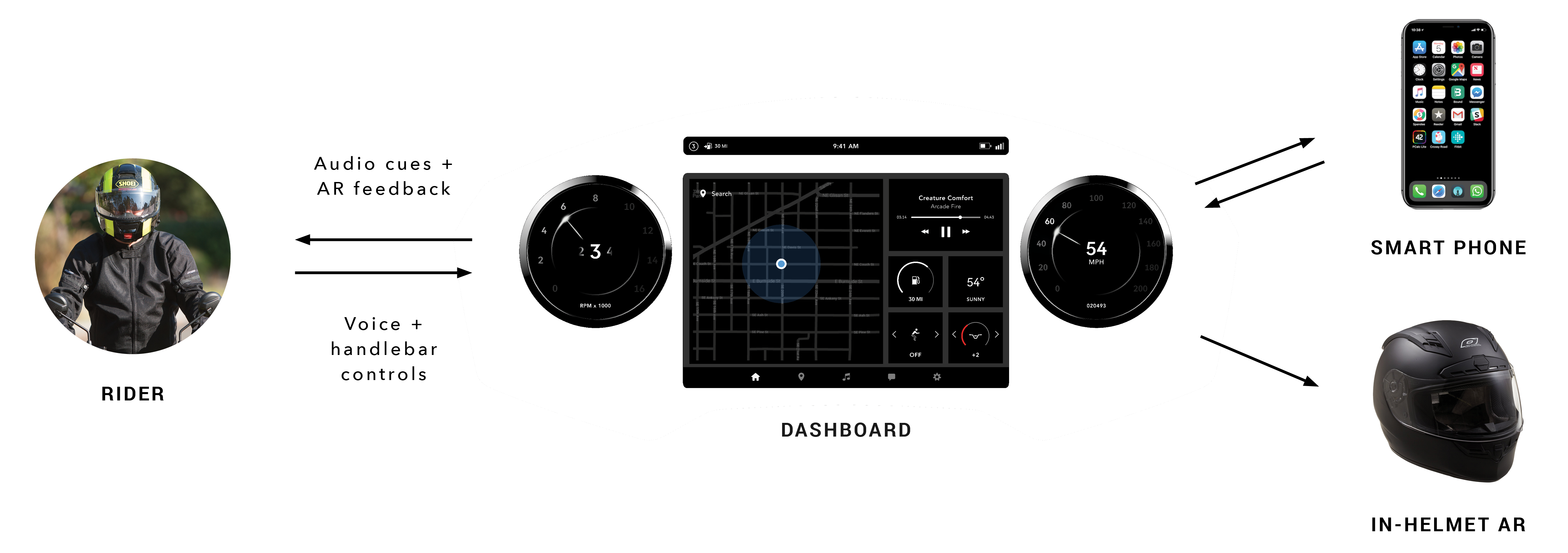
I developed the ecosystem for the BMW iRide to allow the user to interact with their phone as easily as possible. The dashboard is the main control point for the system, which the user interacts with thru voice commands and controls on the handlebars. Like the information pyramid showed in the sections above, the most important information is then pushed up to the AR in the helmet.

